Over the past few weeks we’ve attended a couple of different events hosted by Biodiversity and Climate Change Virtual Laboratory (BCCVL). In this blog, Alex and I are going to recap the events we attended, and Jake has put together a potential solution to an issue that was raised in one of the workshops, just to see how we could help to solve some of these problems. So this is a bit of a patchwork blog, from all three of us.
BCCVL Species Modelling Workshop (Alex)
On July 19 Jake and I attended a workshop on ‘Innovative tools for mapping and modelling species distributions‘ at Curtin University.
Drs Sarah Richmond and Chantal Huijbers from the BCCVL at Griffith Uni presented a workshop for c. 20 participants. By extracting species occurrence data from the spatial portal of Atlas of Living Australia (ALA) and importing it into the BCCVL we were able to:
- understand the need for careful selection and ‘cleaning’ of the spatial data
- submit the cleaned dataset to various ecological models, including developing predicted species distribution models (see Figure 1), and then
- analyse these putative distribution models under various future climate change scenarios.
This was all done within the BCCVL’s online portal, shown below.
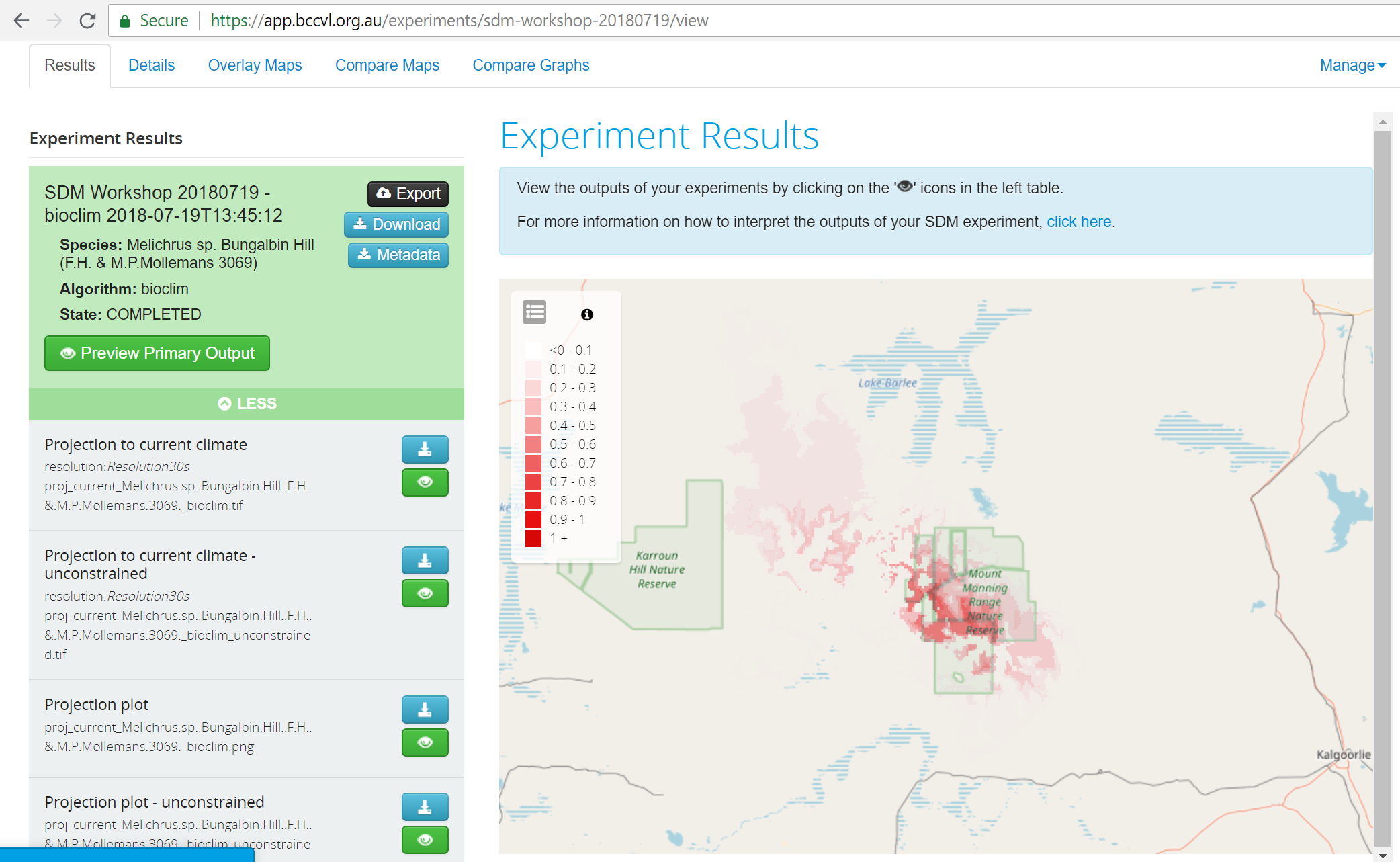 A predicted species distribution model in the BCCVL.
The BCCVL presents complex spatial data layers, modelling concepts and algorithms in a very usable web portal. It does not, of course, remove the need for users to understand the limitations of the available data or the applicability of models and algorithms. A more advanced modelling environment – the EcoScience Research Data Cloud and Data Enhanced Virtual Laboratory (EcoCloud) was also announced and will be available shortly.
We were very interested in some of the ways that data was presented, and the tools that the BCCVL were making openly available – they seem to be things that we could potentially use in our own work, or we can recommend to our clients.
Perth EcoScience Pathways Forum (Andrew)
The following day I attended another BCCVL led event: the ‘Perth EcoScience Pathways Forum’ at the Department of Biodiversity, Conservation and Attractions. This event aimed to provide an opportunity to learn more about existing digital infrastructure, training and skills development programs for environmental science, and it also showcases research and exemplar users of digital technologies. A big part of this is that it also aims to ignite discussions around common issues and practices.
The earlier part of the day focused on some of the interesting research happening in this space, it was great to see our BioSys and Climatewatch projects getting a mention at various points. A few of the highlights for me from the morning session were:
- Paul Gioia talking about BioSys and the recent work we have done on a new mobile tool (more to come on that in a future project summary),
- A demo of the soon to be released EcoCloud system, and
- Dr Nicki Mitchell from UWA discussing how they have been using Climatewatch as a data collection and analysis tool for their first year biology students
In the afternoon the focus shifted from research to discussing issues and challenges attendees were having in their day to day work. There were a number of interesting issues discussed but the one that really peaked my interest was related to fire data. A number of people in my group were frustrated that they weren’t able to see all relevant fire scar data in one place, but also that they weren’t confident in the fire scar boundaries – they found it difficult and time consuming to ground truth them using aerial imagery. I’m always keen to hear about problems like these because solving problems is exactly what we do here at Gaia Resources.
Once I got back from the forum I asked Jake if he could take a look at the fire scar data and see if he could put something together as a proof of concept for how this task could be completed more efficiently.
Fire Scar Data (Jake)
Andrew’s already set the scene for what he asked me to do – a way of looking at some relevant imagery, and fire scar data, to make it really easy for people to ground truth those areas.
I chose to implement this using a web-based leaflet map, and to show a side-by-side comparison of the data from NAFI (Northern Australian Fire Information) current fire scars (for 2018, at least) and overlay that with the most up-to-date Sentinel imagery. The area displayed on the map clearly shows recent fire scars and if you drag the middle toggle across you will be able to see evidence of this on the Sentinel satellite imagery.
NAFI fire scars are mapped using images from the MODIS (Moderate Resolution Imaging Spectroradiometer) instrument carried by NASA’s Terra satellite. These images have a resolution of 250m as you can probably examine if you zoom into the edges of a fire scar boundary, where they appear blocky and pixellated.
Using the NAFI and Sentinel web services makes it really easy to display relevant data quickly and without the hassle of downloading large datasets and pre-processing data, but the downsides to this workflow are lower resolution results and not being able to analyse the data in an in-depth way – something you’d do in a desktop spatial package, like QGIS (and I have to give a plug for our free online QGIS training course).
If you would like to know anymore about how we set up this sort of web map, data sourcing, or anything else, feel free to get in touch via our emails below, leave a comment, or start a conversation with us on our Facebook, Twitter or LinkedIn feeds.
Comments are closed.