I attended the NESP Threatened Species Recovery Hub Roadshow recently, hosted by WA’s Department of Biodiversity, Conservation and Attractions Science Division. The Threatened Species Recovery Hub brings together leading ecological experts to carry out research that improves the management of Australia’s threatened species, and many of them presented at this day-long roadshow.
Hub researchers joined with decision-makers, land managers, NGOs and community organisations in Perth to discuss findings and research collaborations of relevance to Western Australia. Presentations covered a wide range of topics including talks on the most imperilled WA species, the efficacy of safe havens, community engagement for threatened species and the role research partnerships play in informing on-ground actions such as species translocations and reintroductions.
Of particular interest was the talk Elisa Bayraktarov (UQ) on developing a Threatened Species Index for Australia as a method for providing a standard comparative scientific method for understanding the rates of species decline while raising the public profile of our threatened species. The first Index, for threatened bird species, will be launched at the upcoming Ecological Society of Australia Annual Conference in Brisbane in November.
This topic led us into discussions back at Gaia HQ as to how publicly-available data can be assembled to show the stories of threatened species, as well as the processes that are potentially contributing to their decline. We set two of our spatial team the task of developing within four days a time series web map to illustrate key data elements for one of Australia’s top 20 mammals most at risk of extinction – Leadbeater’s Possum (Gymnobelideus leadbeateri), and the results are pretty powerful (click on the image to open the web map in a new window):
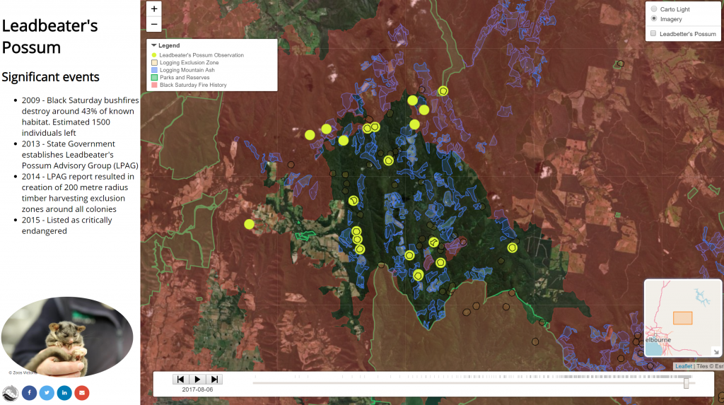
In just four days, Barbara and Jake created the web map with the following spatial layers:
- Possum observations: 1179 unrestricted, publicly available points from 1950 to 2018, from Victorian Biodiversity Atlas fauna records.
In the timeline we set these points to display only for the length of the year they were made. The complete set of observations is available to display in the layer control on the top right; - Parks and reserves boundaries: 350 polygons from 1919 to 2018, from Collaborative Australian Protected Areas Database (CAPAD) 2016 and filtered to show only conservation and national parks and reserves,
- Logging coupes for Mountain Ash: 4148 polygons from 1960 to 2017, from Spatial Datamart Victoria.
In the timeline we set these polygons to display for the length of twenty years on the simplistic assumption that subsequent regrowth could again provide possum habitat after that length of time. Actual land use is included only by visual inspection of the recent satellite imagery made available as an alternative base layer. - Logging exclusion zones: 1028 polygons from 2014 to 2018, from Spatial Datamart Victoria,
- Black Saturday fire extent: 87 polygons from the 2009 event, from Spatial Datamart Victoria,
- Cartographic base layer sourced from CartoDB and satellite imagery from ESRI World Imagery,
- Significant events text: primarily sourced from Friends of Leadbeater’s Possum fact page.
The web mapping application is built with Leaflet and multiple plugins were incorporated to create a timeline slider, minimap reference locator, and legend. The following image is a zoomed extent to a northern population of Leadbeater’s Possum displaying content from all these spatial layers. To be honest, the data wrangling took more time than building the web map (which is all using open source software and plugins!).
Try out the live web map yourself – we’d really be interested in your feedback! Of course, this is not a scientifically robust model but rather an example of what can be assembled to graphically illustrate a range of events that together can tell stories about threatened species survival in the face of threatening processes, and the ongoing actions to help conserve the species.
The main challenges in this exercise were:
- locating relevant datasets for a species we were not familiar with,
- acquiring Victorian datasets and deciding which ones were most suitable,
- deciding which events had the most impact to display on the web map timeline,
- understanding the major threats and portraying them on the web map,
- converting shapefiles into formats suitable for web mapping,
- building a visually pleasing and informative web map,
- the timeline slider can only handle so much data and will slow down significantly if too much is added. For example we originally intended to add all available fire history for the study area, however, we found that attempting to visualise c.9000 polygons from 1928-2018 made the timeline slider unusable,
- preparing the data for inclusion in the timeline slider was tedious – considerable geometry simplification and attribute editing were necessary to export timeline ready data.
Nevertheless, we consider this style of spatial visualisation a useful method for presenting data and developing compelling conservation stories for researchers and the community.
If you’d like to give us your feedback on the webmap, or know more about how we can help you with research programs, data management or spatial information systems, then please leave a comment below, start a chat with us via Facebook, Twitter or LinkedIn, or email me directly via alex.chapman@gaiaresources.com.au.
Alex
Comments are closed.