I have a habit of afterhours tinkering with spatial things that interest me. I have yet to decide whether this is a good or a bad habit but it does give me a chance to play with things that aren’t really related to what we do at Gaia Resources on a daily basis. My latest bit of tinkering relates to attempting to visualise my public transport use.
Transperth have been nice enough to make their route and stops data freely available on their website, they also make your transaction history available if you have a SmartRider card. These two things are crying out to be put together, so I thought I would see if I could hack something up to take my SmartRider transactions, plot each route travelled and do some calculations for carbon production and cost.
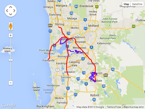
Because this was an experiment more than anything I decided to write the code in MapBasic for no other reason than that I know the language quite well and I would allow me to get a result fairly quickly. The map below shows my SmartRider transactions for all of 2010 (train in red, bus in blue).
Interestingly enough creating the routes from the SmartRider transaction data is relatively straight forward not withstanding a few issues I had with trying to reverse engineer the structure of the transaction report. The tricky part was trying to calculate carbon production from this public transport use – I was expecting to just jump on Google and quickly find a tonnes/kilometre value. What I found though was that there are a myriad of different carbon calculators but they all seem to use different numbers and in some cases these were wildly different. As a result of that I would say that the carbon figures are only really valid as a comparison against each other rather than actual numbers.
The Results
For the 2010 calendar year I traveled 15,247.69km on public transport split between train and bus, I used this distance to estimate carbon production and costs and compared this against the equivalent distance traveled by car.
Estimated carbon produced
- Public Transport – 0.71 tonnes
- Equivalent distance by car – 2.90 tonnes
Estimated transportation costs
- Public Transport – $1,646.16
- Equivalent distance by car – $4,574.31 (fuel consumption + running costs)
From the results it appears that traveling by public transport only produces about a quarter of the carbon and costs about a third of traveling by car. Sounds like a big win to me – and gives a real context to why Gaia Resources gets all our employees to estimate our public transport use, and then raises our salary to cover us using public transport to and from work!
I should note that Transperth have a carbon calculator on their website, but it doesn’t link to SmartRider and therefore requires you to add in your own distance figures to do the calculation – which is difficult to do without GIS.
I still have a few things I would like to do to enhance what I have so far – Ideally I will rewrite the code in a “nicer” language and shift all the data into PostGIS, which I haven’t really looked into yet but am hoping this will allow me to use PgRouting to more accurately calculate the distance travelled by car. I am also thinking about adding travel time estimates, this gets complicated by peak hour traffic though.
As an experiment into something a bit different, but still with an environmental theme, I think this was a good way to spend a few evenings.
Comments are closed.