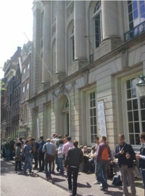
Thursday the 12th and Friday the 13th of May 2011 I attended the first Mobilism conference in Amsterdam, The Netherlands. A conference which focused exclusively on web design and development for mobile devices. Two days of talks by renowned mobile web developers and designers about the future of the mobile web.
The setting along side the channels of Amsterdam in the majestic Felix Meritis in combination with the small scale setup gave it a nice atmosphere. Besides the talks which ranged from native versus web, performance, design approach and the future of the mobile web there was also lots of room to talk to the speakers in person.
There is already a lot written about the conference, therefore I will highlight the things that caught my attention. A lot more can be found at the Mobilism website.
Highlights
“Mobile First” by Luke Wroblewski talked about how we should make the shift to designing for the mobile web before the desktop web. Using lots of statistics he emphasized on the enormous growth rate of mobiles compared to desktops and laptops and the opportunities that come with it. Some of the advantages of putting mobile first would be that we have to deal with its constraints and therefore have more focus on what the user actually values most. The fact that mobiles are mobile gives the user more time and more places to use the mobile web. How does this affect the design? Mobile forces you to focus on the content apposed to graphical design. Interesting examples where given about how to get rid of for example buttons.
What caught my attention in Peter Paul Koch’s (PPK) presentation about “the future of the mobile web” was the things he said about how he thinks applications will be distributed in the future and that applications will be free. PPK sees a significant decrease in the number of and specialization in the appstores (over 100 at the moment!) over time. People will likely start sharing apps via mediums like Blue Tooth and pay for data via for example sms instead. He also sees that carriers will play a big role in payments with the mobile in the future.
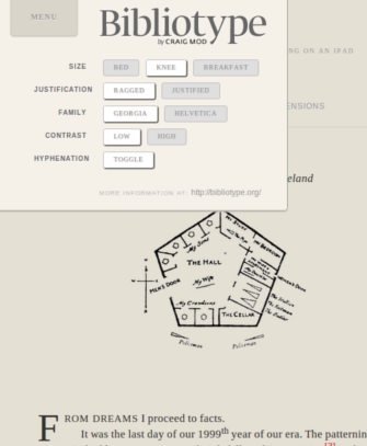
Stephanie Rieger took it even one step further in her presentation “beyond mobile”. Stephanie talks about how we should allow the user more control when designing for the mobile web. So many sorts of mobile device are connecting to the web nowadays that it is hard if not impossible for us to decide on the context in which the web is accessed. She believes in setting a user experience baseline but also the functionality that lets the user give more control over things like data size/amount (e.g. YouTube’s HQ button), font types, font sizes and color schemes (e.g. BibilioType ) . Also interesting to hear that there are a lot of people out there who’s sole connection to the web is via mobile! In a lot of countries data packages are still very expensive. Why not give the user some control in that regards and let them adjust data consumption, says Stephanie.
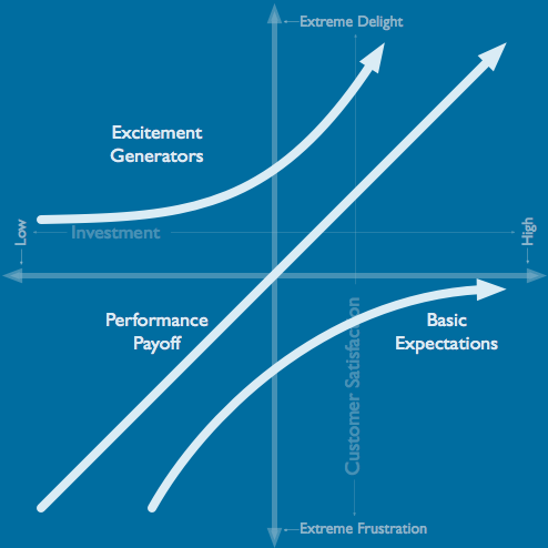
A competitive advantage that keeps users coming back and spend more time using your web/application is web performance optimization. Steve Souders talked extensively about this topic in his presentation “high performance mobile”. He mentioned the negative effects of latency and talked about some interesting tools and techniques to counteract this. Have a look at his his new website Mobile Http Archive for some interesting statistics. Steve also predicts that people are going to expect near zero latency in their experience which was elaborated on by Jared Spool when he talked about the Kano Model (A tool to predict user satisfaction) in his presentation “Mobile & UX: Inside the Eye of the Perfect Storm”.
Scott Jehl, a member of the Jquery team talked in his presentation “building tools for a changing web” about jQuery Mobile (JQM). JQM is a one code base framework that can be used to build good looking mobile websites which work on a broad range of platforms. JQM is build on top of the immensely popular Jquery Core library which is used in many websites around the globe. (And indeed by us for some of our mobile projects).
Mobilism was a great balance of technical talks and more abstract talk about where we are and what the future could look like for the mobile web. Definitely worth to keep your eye on the fire here!
Drop me an email – or leave a comment below.
Comments are closed.